Dagoca Font


FONT DETAILS AND DOWNLOAD
Dagoca is published on Creative Fabrica. Check the product page for the current price, the license terms and the download options before you install it on a client project.
SEE PRICE AND LICENSE ON CREATIVE FABRICA
Creative Fabrica shows the current price, the download options and the license version on the product page. Read it before you use the font in a commercial project.
More About This Post
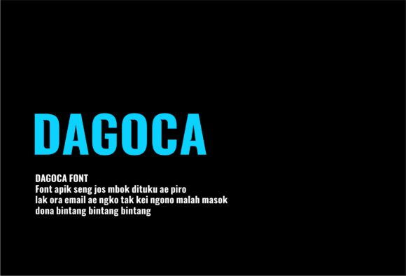
Plenty of condensed sans serifs try to look neutral and end up invisible. Dagoca Font takes the opposite road: heavy strokes, tall capitals squeezed into narrow widths, flat squared terminals, and spacing so tight the letters almost touch. It reads like paint on a gym wall, which is exactly where the preview sets put it.
A Dagoca Font download is easy to find on sites that repackage other people's files. Those copies arrive without the license text, and the license is the part you need when a client asks who owns the artwork. Start from the designer's product page instead, credit intact.
What the previews show is one heavy display style, not a family: capitals and lowercase, no light companion, no italic, nothing built for long settings. The specimen credits the design to kreabie, and every sample uses the face the same way — short phrases, set large.
That makes it strong on t-shirt fronts, sportswear graphics, poster titles and loud logo lockups, where the word is the image. It is the wrong tool for paragraphs, captions, small interface labels or anything that has to stay readable at business-card scale; the counters are too narrow to survive the shrink.
Licensing deserves more attention than the price. Creative Fabrica grants access through personal and commercial tiers, and its own FAQ places server installation, broadcast advertising and app embedding outside the commercial tier. Which tier this particular font carries is printed on the product page, and that page is the only place worth trusting for it.
Before you install anything, set the exact headline you plan to use — not the specimen word — at the size it will actually print, and look at it at 100%. Watch the joins in pairs like AG, CO and CA, and check that the lowercase you need is drawn rather than substituted. If the spacing holds there, it will hold on the shirt.
If the sample already suggests the tone you want, open the Dagoca Font product page, read the license line, and measure the face against your own headline before you commit. Letterform notes come from the product preview images on this page; license limits checked against Creative Fabrica's FAQ on 21 October 2026. Prices and terms change without notice.
VERDICT: TOLAK - nama desainer salah tulis: kreabie seharusnya kreabie (preview produk)
website: https://db-ku.com
This site includes affiliate links. Some content is provided by third-party sources. Using these links may modestly support our work at no additional cost to you.